Dark Hero
2023 Kitchen Sink QA
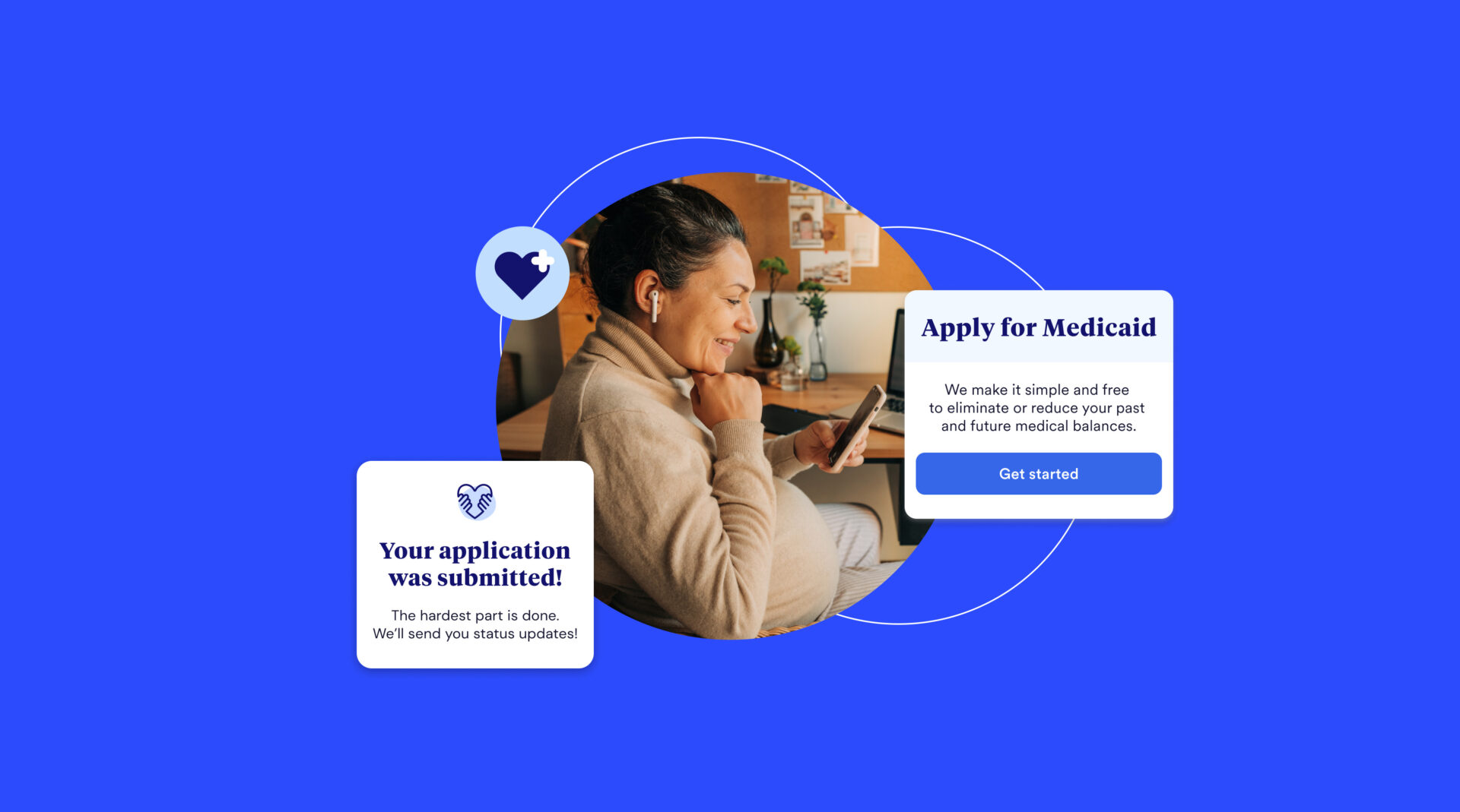
The hero block is a two-column section typically placed at the top of a page, although it can work well as a content block too. Layout consists of some text on the left, an image on the right, and some secondary text and images at the bottom.
Link to Content Link to elsewhere
Secondary section with logos – use white or very light logos


Test hero with image logo
Test hero with image logo

test
Light Hero
Light version of the hero block.
The hero block is a two-column section typically placed at the top of a page, although it can work well as a content block too. Layout consists of some text on the left, an image on the right, and some secondary text and images at the bottom.
Contact Us Link to Elsewhere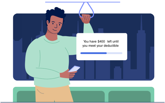
Secondary section with logos – use color/darker logos


An Introduction with a Large Headline
This block is tailored to come after a hero block and before some more detailed content. It supports an image with the option of adjusting its maximum size, as well as the option to adjust the top and bottom margins for optimal placement between different content blocks. Background and text color can also be edited by using the color pickers at the bottom of the editor block.


Headline 1
The hero block is a two-column section typically placed at the top of a page, although it can work well as a content block too. Layout consists of some text on the left, an image on the right, and some secondary text and images at the bottom.

Headline 2
The hero block is a two-column section typically placed at the top of a page, although it can work well as a content block too. Layout consists of some text on the left, an image on the right, and some secondary text and images at the bottom.
This one is pretty cool
This block is intended for use with multimedia items, particularly video. Default layout is image left and text right, with the option to reverse it to text left and image right.
This is a pretty versatile block
Here’s a version with a horizontal video and updated background/text colors. While it’s pretty versatile, there are other blocks better suited to general content. Those will be outlined in the coming blocks below.
Alternative Layout and Colors
Here’s a version using a horizontal image superimposed in a laptop mockup with a white background. Note that choosing a custom color for the background overrides the color of the whole section.
One last example
Here’s a tablet orientation video using default image left, text right layout.
Split Hero Large Art
Split Hero Large Art
Headline Text
Copy text
Video Block
Lorem ipsum dolor sit, amet consectetur adipisicing elit. Adipisci similique distinctio, recusandae ipsum quisquam, quas reprehenderit
Lorem ipsum dolor sit, amet consectetur adipisicing elit. Adipisci similique distinctio, recusandae ipsum quisquam, quas reprehenderit
Lorem ipsum dolor sit, amet consectetur adipisicing elit. Adipisci similique distinctio, recusandae ipsum quisquam, quas reprehenderit
Testimonial block with animated carousel.Top or Bottom
No limit on how many slides you can add, but more than four or five is probably overkill.Use the Color Picker
You can also change the position of the indicator dots to be above or below the testimonial block.Change the Appearance
Here's a block with the dots on top and default background color.With options
Full Width CTA Banner
This is the default CTA banner, full width with a light green background. Options include a CTA button that can link to an internal page or external website, an embeddable form such as a HubSpot email subscription, left/center/right alignment, and an image.
Contact Us
Boxed Width with Orange Background
Alternative style to the full width green CTA, this one works well with pages that have a lot of white space. Has the same options as the full width CTA regarding alignment and images.
Contact Us Three most recent posts
With optional link

General Content Block
One or Two Columns

This block has a fair amount of options: one or two columns, headshot/icon images above main text, larger images below main text, and link buttons.
Add Images and Links
Add additional descriptions, images, and buttons as needed. Background and text color can also be changed using the color picker in the block editor.
Here's a one-column version
One column general content with customized colors and image.
Two Column CTA


Second Vertical Tab Section
-
Second section tab one
This is just to show two independent tab sections operating on the same page.

-
Second section tab two
Off white background added to show contrast.

Featured Case Study
Case Study Eyebrow
Featured Case Study Title
Explore Products Block
Like the vertical tabs, multiple instances of this accordion block can work on the same page without conflicting.

These rows will expand to the size of the content within. There isn’t a limit to how much content you can add, but there is a limit to where it starts to look odd.
Just showing it won’t conflict with the accordion appearing earlier on the page.
Second row of the second accordion.
This block is basically a fully featured contact us page.
Some Logos


Featured Posts - works only in blog posts, since it gets posts by related category
This section adds a series of quotes with attributions below.
There's no limit, but two to three quotes should be sufficient.
Background color can be customized.
Firstname Lastname
Lorem ipsum dolor sit amet, consectetur adipisicing elit, sed do eiusmod tempor incididunt ut labore et dolore magna aliqua. Ut enim ad minim veniam, quis nostrud exercitation ullamco laboris nisi ut aliquip ex ea commodo consequat.

Firstname Lastname
Duis aute irure dolor in reprehenderit in voluptate velit esse cillum dolore eu fugiat nulla pariatur. Excepteur sint occaecat cupidatat non proident, sunt in culpa qui officia deserunt mollit anim id est laborum.

Info, Logo, Quote Block
Some descriptive information. Lorem ipsum dolor sit amet, consectetur adipisicing elit, sed do eiusmod tempor incididunt ut labore et dolore magna aliqua. Ut enim ad minim veniam, quis nostrud exercitation ullamco laboris nisi ut aliquip ex ea commodo consequat.
Quote from a satisfied client or customer. Duis aute irure dolor in reprehenderit in voluptate velit esse cillum dolore eu fugiat nulla pariatur. Excepteur sint occaecat cupidatat non proident, sunt in culpa qui officia deserunt mollit anim id est laborum.
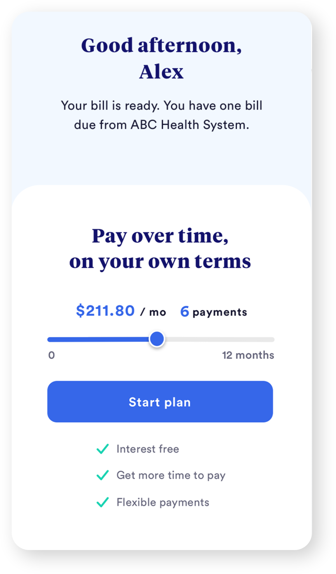
Product Title 1
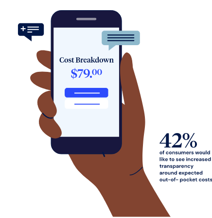
Consumers gain confidence in the billing process when they see benefits coverage verified by insurance as soon as new bills are ready–no more waiting for paper EOBs to arrive by mail.
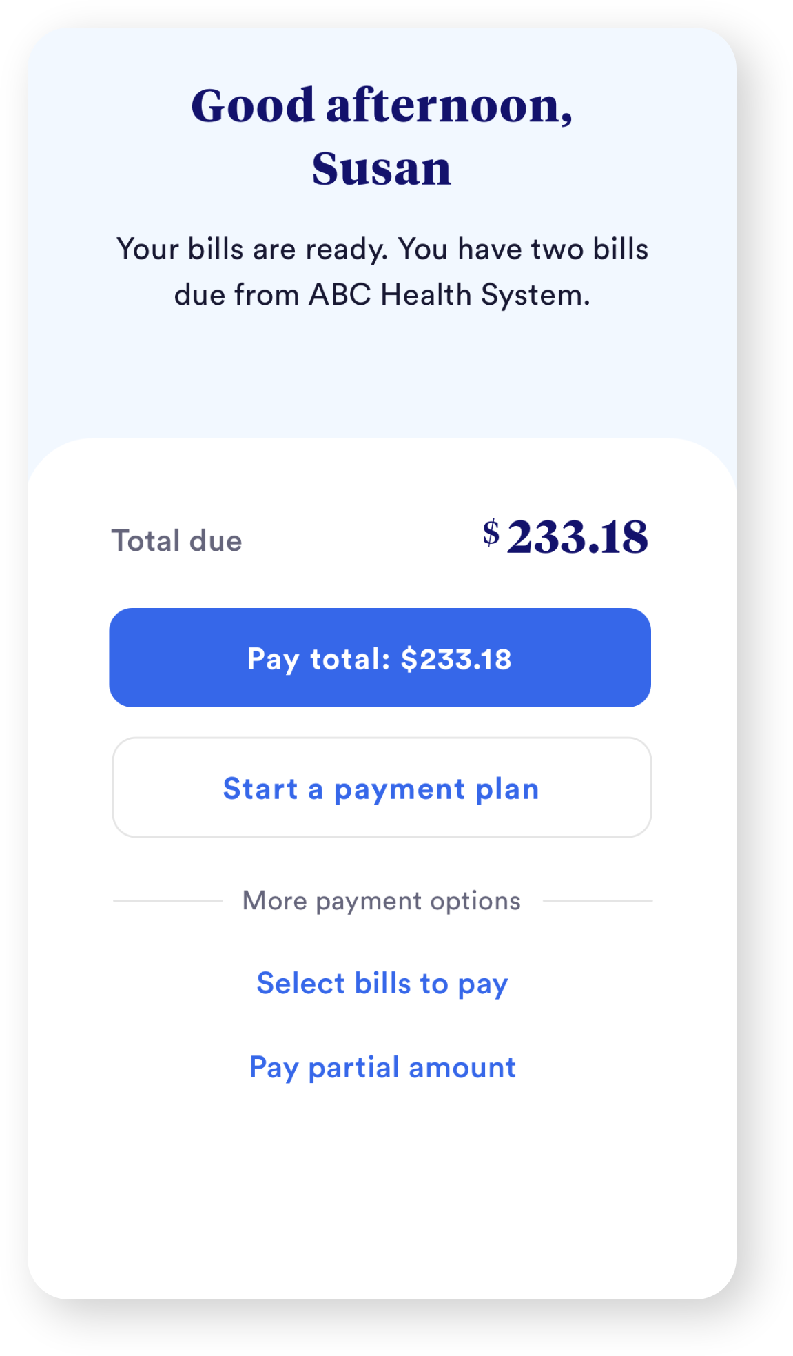
Product Title 2
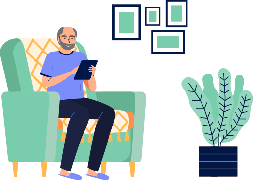
Consumers gain confidence in the billing process when they see benefits coverage verified by insurance as soon as new bills are ready–no more waiting for paper EOBs to arrive by mail.
Product Title 3
Consumers gain confidence in the billing process when they see benefits coverage verified by insurance as soon as new bills are ready–no more waiting for paper EOBs to arrive by mail.