The best designs often seem simple and obvious. Consider Apple’s iPhone: Switching to the new iPhone is seamless and delightful because it remembers your preferences and transfers your data to make you feel at home in your new device. Designing a product that has simplicity, however, is not simple. John Maeda, Chief Experience Officer of Publicis Sapient and author of The Laws of Simplicity, says: “Simplicity is about subtracting the obvious and adding the meaningful.” The iPhone feels simple, because it is actually meaningful.
As a lead visual designer at Cedar, I know all too well that uncovering the meaningful is not easy. I believe good design is human-centered design, which means all the decisions we make at Cedar put the patient at the center of the design process. What do patients need to see when they’re struggling to pay a bill they don’t understand? How do we talk to patients in their time of need? In healthcare, we interact with people during some of their most intimate and emotional moments, which makes the designer’s job even more impactful.
Driving meaningful engagement with patients requires a complex regimen of design rigor: research, data analysis, collaboration, exploration, experimentation, testing, feedback and iteration. However, the pay off for tackling product design challenges well and actually providing a seamless experience to consumers cannot be ignored. A 2018 report by McKinsey & Company revealed that organizations with the best design also achieved the highest revenues and shareholder returns. In fact, the correlation between the best design experience and outsized financial performance was most pronounced in medical technology, among the industries studied. In other words, good design is good business (especially in healthcare).
At Cedar, the connection between patient-centric design and business results is core to our thinking. We constantly push industry standards in order to evolve and improve the user experience. A better interface drives higher patient engagement, which leads to significantly improved financials for providers. Our data and research-led design approach mirrors that of the most sophisticated consumer businesses. The same consumers who love the convenience of Amazon are bringing those expectations for ease and practicality to all aspects of their lives, including their interactions within healthcare.
Design Imperatives: A Patient-First Platform Requires Accessibility and Usability
The waiting rooms that felt ‘on-brand’ for Cedar tended to be those that resembled therapists’ offices. To the workshop participants, they felt “dignified,” “safe” and had a vibe of “professional candor.” These adjectives helped to inform the design system that followed.
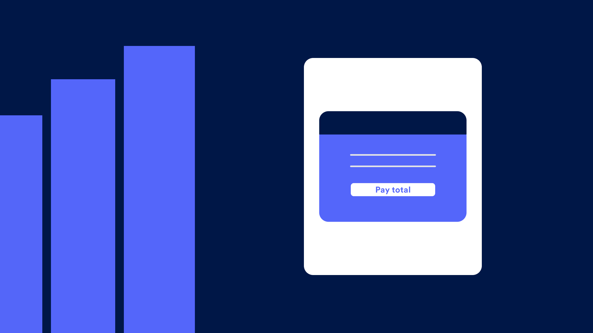
Accessibility and usability are top priorities for the product design team at Cedar.
While these requirements are important across industries, they’re arguably even more so in healthcare. Patient populations are representative of the general population (all ages, demographics, socio-economic characteristics), and when you compound that with the fact that users are likely to access the platform while dealing with health-related impairments, designing products that are accessible and usable is essential to creating a positive user experience.
Ensuring accessibility enables people with disabilities to perceive, understand, navigate, interact and contribute content to a web-based platform. Can you imagine a hospital without handrails and ramps? Similarly, we couldn’t imagine not adding that same level of care to our product.
Advancing Thought & Gaining Alignment Through Workshops
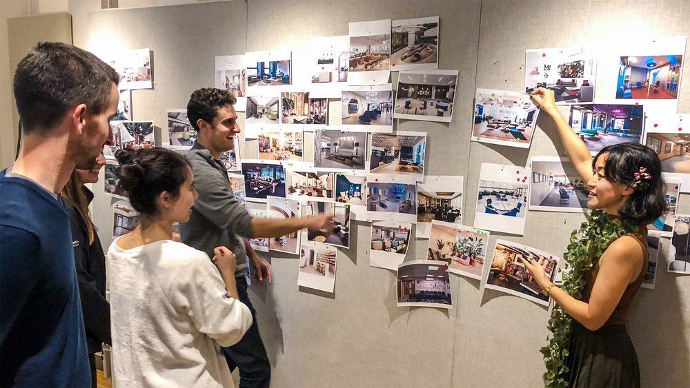
Gaining stakeholder feedback and alignment is critical to inform design direction. Using a workshop model to foster conversation and design thinking can be very effective in producing this outcome. This is exactly what our Cedar design team did a few weeks ago leveraging a best-practice methodology from Cooper, an interaction design firm.
In the workshop, we gathered internal stakeholders from across functional Cedar teams representing engineering, product, patient engagement and design. The goal was to identify how we want our brand to be experienced by our users. In order to facilitate this, we picked a ‘theme’ for the exercise that was tangentially related to Cedar and what we do, but different enough so that we could discuss attributes that we like and don’t like in order to apply those concepts to our own product experience. For instance, you might pick a theme like cars and then ask your group to determine if your brand experience should be ‘fast’ and ‘showy’ or perhaps ‘reliable’ and ‘safe’.
So…What Kind of Waiting Room Would Cedar Be?
Rather than cars, we picked ‘waiting rooms’ as our domain provocation exercise, and hung more than 100 pictures around the room during our session to facilitate discussion. We’ve all experienced waiting rooms and have distinct reactions and feelings associated with those settings. Through open conversation, we identified adjectives (both positive and negative) that described the various options we presented. From this discussion, several themes emerged that we then synthesized and developed into scales (see visual). The scales served as a framework for us to rate where we wanted to exist as a brand.
Translating Feelings Into Action: Create, Test, Learn…Repeat
The workshop output ultimately informed the next phase of design exploration and aligned us all around a common understanding of the intended brand experience. At this point, I designed dozens of UI examples (various fonts, colors, graphical elements and styles for the platform), all informed by my interpretation of the ranges we want to achieve. Then I obtained feedback from our design team as to which explorations felt the most aligned.
Finally, with three different design options in hand, we launched into user testing. The goal of this phase is to allow patients to experience the new UI while responding to a common situation someone might have to navigate on the Cedar platform. Suppose you had a procedure at a healthcare provider and received a bill that was higher and more complicated than you expected. In an all-too-common, anxiety-ridden scenario like this, we want to understand how a patient engages with our UI, how they respond, which questions they may need answered, and how we can make the experience as “dignified,” “safe” and with as much “professional candor” as possible. We gauge the users’ reactions and collect insights from this process. This allows us to iterate our design, armed with valuable information on how to best engage with patients and provide the most friction-free path to bill resolution.
The boon here is that by providing an experience that is good for patients, Cedar’s clients–who have offered a critical healthcare service–are also benefiting. Connecting the incentives between patient and provider is what ultimately offers the win-win and I see the direct connection between what we design at Cedar and the outcomes that follow.
Want to see the updated look and feel of Cedar’s UI? Stay tuned for the launch in early 2020. To stay informed on the trends patients most want from product design.
Download the 2019 Healthcare consumer study executive brief.

Mu-Hwa Kuo is a Senior Product Designer at Cedar where she is leading the charge on creating a design system. Previously at American Express and Cloudberry Creative, she believes that anyone can make complex concepts feel both simple and intuitive using strategic design. She thinks the west coast is the best coast, but New York has its charms.